01
FLY NOW PAY LATER

UI Improvements

The business took the opportunity to upgrade some screens and ensure consistency with the component library while the engineers were working on a faster app. Various concepts were rapidly tested, and a bunch of screens were created for consideration, with the left image depicting the current design.
Current VS New UI
02

Login screen

The login screen was redesigned to make it more impactful by simplifying the login/sign-up process and adding a clear and explicit 'Create Account' button. Geolocation was also incorporated into the login process to provide a more seamless user experience.

These changes are expected to enhance user engagement and help users progress through the login process more effectively. By creating a more straightforward and streamlined login experience, the redesign aims to improve the overall user experience and increase user satisfaction.
03

Onboarding screen

I acquired the style for the flight search journey in the first phase of the project and implemented Material Design recommendations to improve the user experience in input fields.

The UX test plan for the future were to conduct a usability test to assess user preferences for tracking their progress while inputting their details. This testing aims to improve the user experience by identifying any areas where users may encounter difficulties or confusion during the search process.
Bezel with progressive onboarding
04

Request loan

To improve user experience and prevent errors in selecting the correct borrowing amount, and taken into account feedback from users regarding the difficulty of using the free input field. As a result, I have made the decision to replace the free input field with a slider control.
Request a loan
05

Booking screen

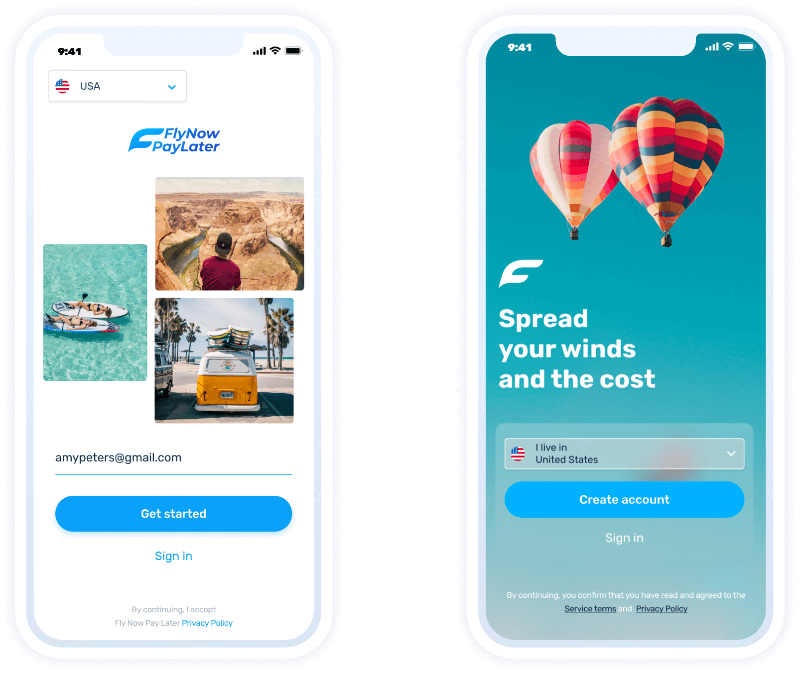
We've redesigned our flight booking screen to add hotels, making it easier for customers to plan their travel. Our approach is simple, with tabs allowing users to switch between booking flights and hotels. This streamlined process eliminates complicated menus and navigation, making it quick and easy to book both flights and hotels on the same platform.To enhance the user experience, we've added an inspirational image that evokes a sense of adventure and exploration. At our company, we're committed to making travel planning as easy and enjoyable as possible. We believe that these changes will improve our customers' experience, and we're always looking for ways to make their journey with us as smooth and convenient as possible.
Booking screen
06

Chatbot

To alleviate the high volume of customer support emails, we've introduced a new chatbot feature. The chatbot allows users to navigate through a catalogue menu to resolve their queries, providing an easy and efficient way to get the help they need. If the issue cannot be resolved via the chatbot, users can raise a support ticket. This feature is designed to streamline the support process and reduce the time it takes to resolve customer queries, improving the overall customer experience
Booking scree
07

How it works screen

As we've introduced a new flow that enables users to create a loan and book a flight, it's important that the user interface is updated accordingly. To make the process as intuitive as possible, I propose an upgrade that includes a prompt. This prompt will guide the user through the process in three easy steps, scrolling down the screen as the user progresses. Our aim is to create a seamless and user-friendly experience that allows users to effortlessly create a loan and book a flight.
How it works screen
08

Virtual card redesign

We decided that the electronic card of our app needed a fresh new look. After brainstorming several concepts, I came to the conclusion that adding an image to the card would evoke a sense of holiday and excitement, which is what our users are looking for when they're planning a trip. We carefully chose an image that captures the essence of travel, and we believe that this will make the electronic card even more appealing to our users.
Virtual card redesign